Redesigning Event Registration for Equipment Variability and Flexible Pricing
WeckMethod's industry-defining live certification events and online video programs had outgrown the registration system that supported them. Equipment bundling, multi-tier pricing, and discount logic all needed to work within a flow that was originally built for simple sign-ups. I redesigned the consumer registration experience and the admin tooling behind it.
The registration process hit a ceiling
The existing registration flow was built as a simple price card selector. Pick an event registration package, enter your info, pay. Typically binary; either with equipment or without. That worked when the company offered single-format certifications at a fixed price that cast a wide net.
It began to fail when the business noticed this structure worked against the typical customer brand journey and experience. Buyers of education products repeatedly asked if they could register with equipment, but only portions of the set, constantly. This was easily explained. A buyer's first interaction with the brand is most often physical products rather than education. Education gets purchased once they are hooked.
The business needed to offer consumers flexibility which also represented an opportunity for improved marketability and more robust payment capabilities like bundling support. I took wins where I could in the redesign as the original intent was to simply add a checkbox selector on each item and call it a day. I argued for a reframing of the process that matched our brand integrity and insisted this process was a critical brand interaction moment.
- A modernized, appealing registration experience that communicates value and excites the buyer, not a soulless transaction
- Equipment bundled into registration: visible, toggleable, individually priced
- Trainer-facing tools: attendee lists, equipment inventories, contact exports
- Discount rules that respect the entire variable package, not the original
- Admin equipment library and control for assigning equipment to courses, uploading thumbnail photos
The registration journey & users interacting with it
Three user types interact with the registration system, each with different needs. Consumers purchase; trainers host events and need attendee visibility; admin staff manage orders, logistics and customer support manually due to infrastructure limitations.
There are two individual paths to registration that are distinct for online video programs and live events. Both journeys begin in a hardcoded partial on the product or event sales landing page. Selecting a Live event date leads to an Event Details page, where a registration card is selecting and a payment modal appears. Selecting a registration option for an online program leads directly to the payment modal flow
![[background image] image of landscaping office space for a landscaping service](https://cdn.prod.website-files.com/68312696c5081fe7d23d7f08/69b78a70c86f7eef5da67d1f_Figma_zK912xKdg4.png)
Approaches I explored and rejected
The key point worth noting was my insistence on progressive disclosure. My superior wanted the equipment selection form visible at all times below the registration options in their respective locations for Live and Online service paths. I explored but argued that it was unlikely to matter given the number of selections would make most of the form unviewable in one scroll.
Dedicating branding + tooling for online program partial
- It was agreed that a more defined branding, with a sticky column-scroll checkout total and "What's Included" module was not an absolute necessity and thus it would need to be prioritized post-launch, despite its clear value.
Unique logic for payment splits, more user control in selection form
- The original PRD included new logic for paying in installments, selecting a shipping location, and deliberately listing additional equipment needed as in-line toggle-able options. To keep sprints focused, all payment details were instead kept within the existing payment modals for simplicity, to avoid new logic.
Designing a registration flow that sells, not just processes
I succeeded in vouching for progressive disclosure which enabled the redesign to evolve from dull transaction to a guided experience with progress indicators and a sense of control for the user that matched the integrity of the service quality WeckMethod events and education provide.
Progressive disclosure of the equipment selection form after the user selected their desired registration option card delivered a sense of moving through the process and spreading the cognitive load more evenly. It would be a mistake to thrust decisions on what the user is receiving, the value of equipment bundles, and level of confidence about their purchase before they enter payment info at one time.
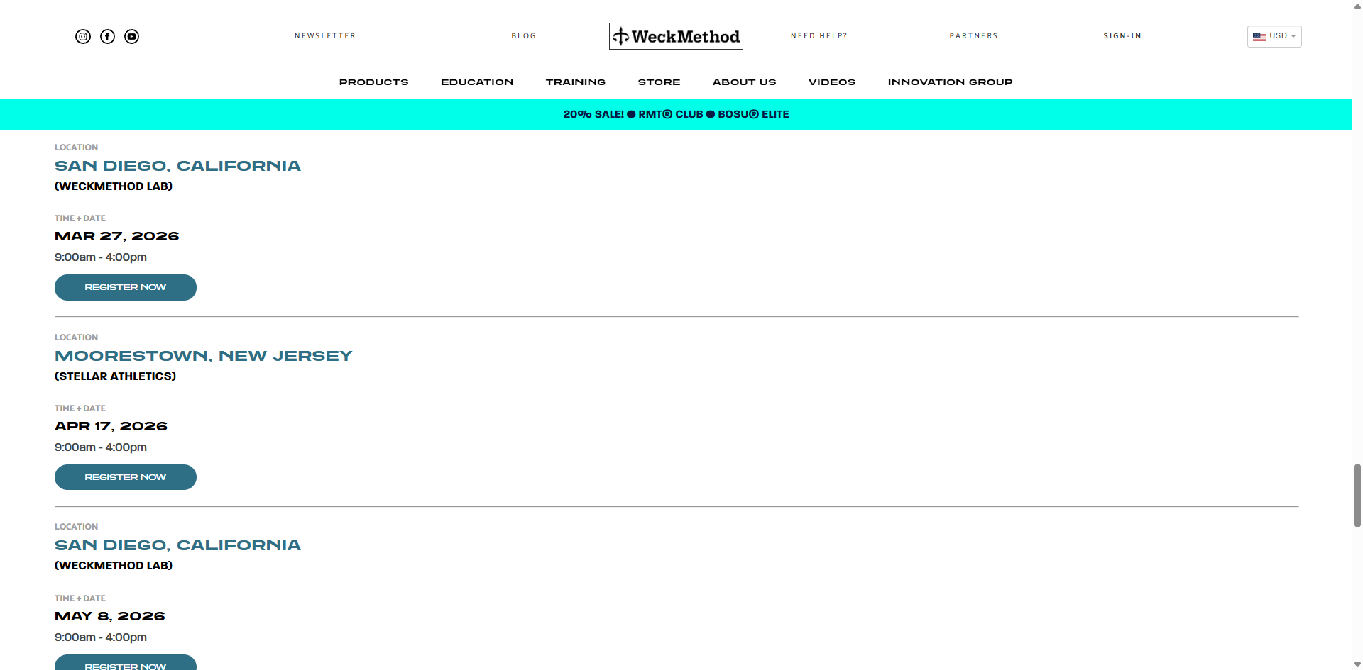
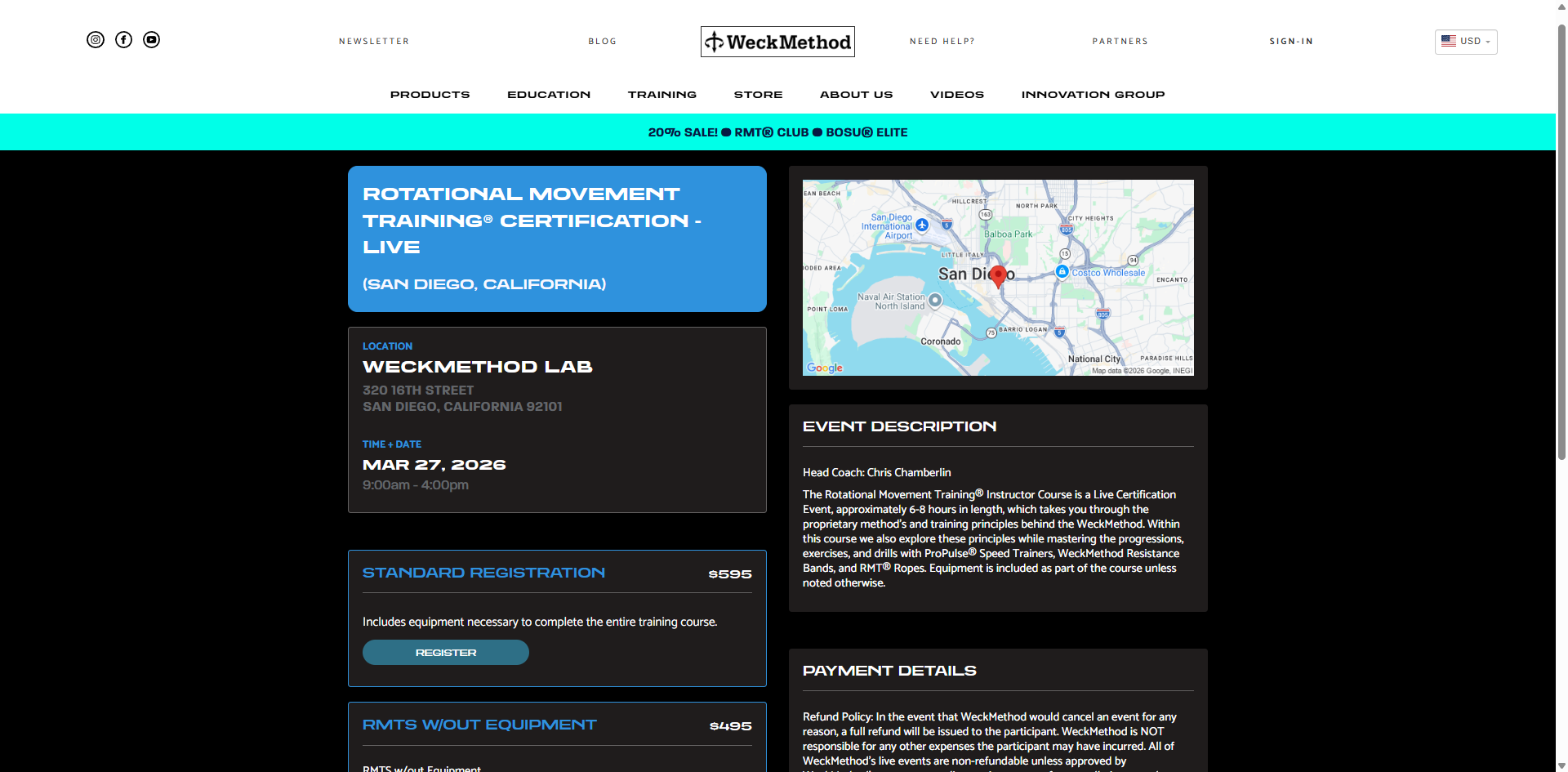
- 01 Event Selection & Overview —Landing view shows an overview; dates, time and location. This page received a UI face lift and although I was unable to spend time reconsidering the entry point itself, this approach generates curiosity for the user to press Register given the page above has informed them of the course contents.
![[background image] image of landscaping office space for a landscaping service](https://cdn.prod.website-files.com/68312696c5081fe7d23d7f08/69b5b82793cf73e76c9b4663_live-services-prototype-1920.png)
- Equipment Selection — Users are presented with the equipment selection form populating upon selecting the appropriate registration card.
![[background image] image of landscaping office space for a landscaping service](https://cdn.prod.website-files.com/68312696c5081fe7d23d7f08/69b3bb73592e6fdf52c0fa5a_event-v7-clean-viewport.png)
![[background image] image of landscaping office space for a landscaping service](https://cdn.prod.website-files.com/68312696c5081fe7d23d7f08/69b3bc9210ca79bfadbe6d3b_equipmentselection.png)
- Pricing & Discounts — The price updates live as users configure their registration. Discounts including early bird, partner code, or bundle savings are displayed as highlighted line items shown inline for complete clarity. Shipping was forced to be kept in the payment modal flow due to the scope being limited in this sprint.
- Payment & Return View — Users are directed to the existing payment modal route where either PayPal or credit card can be selected. The selected options require review given the newly introduced level of complexity . The review step exists because the registration is now complex enough that users need to verify before committing, unlike the old single-price form where there was nothing to review.
![[background image] image of landscaping office space for a landscaping service](https://cdn.prod.website-files.com/68312696c5081fe7d23d7f08/69b45729f1d6972578d72705_returnview.png)
Online course registration
The same registration system needed to handle online courses, not just live events. The pricing and discount logic carry over but the flow is simpler, no event details page means a single-page joureny with transaction completion linking directly to the existing payment modal flow. The online courses registration UI was given a light-mode variant of the Live Events template given it would remain encased within the existing registration partial.
![[background image] image of landscaping office space for a landscaping service](https://cdn.prod.website-files.com/68312696c5081fe7d23d7f08/69b7769808953b06910669c1_course-reg-v8-full-crop.png)
Formulating a journey rather than a transaction
Visual equipment interaction within the selection form
- Equipment is physical. Users need to see what they're selecting, and get excited about it rather than rread a text list. I designed a card-based picker with product photos, short descriptions, and clear pricing. This also doubled as a selling tool naturally, users who came for the certification discovered equipment they didn't know existed.
Live variable pricing updates, no surprise totals at checkout
- Every selection updates the running total immediately. The total reflects selected and unselected equipment and discount code entryit in real-time. I pushed for starting the checkboxes active, including all the equipment in the total by default to make any removals of equipment feel like burden being lifted. Like a relief. Transparency and flexibility reduces support requests and cart abandonment.
Inline accordion registration instead of a separate page
- Live events use a two-step flow: browse on the landing page, then navigate to a dedicated event details page to register. Refraining from adding an extra page to the online program registration, and allowing the selection form to populate directly in the partial allowed for the same design to be reused and new code generation staying limited for efficiency.
One adaptive partial for all live event types
- I indicated CSS classes on vairables like dates, and addresses would allow a single event list template to handle all possible live event types. This meant fewer files to maintain, faster event creation, and no engineering involvement when a new event type gets introduced.
Marketing modules in the online course partial
- Feedback surfaced in user research repeatedly was the fact users often didn't know there were other live events, often even on the same weekend. I added configurable marketing modules to the online course partial for upsell cues, related products, or promotional content.
Equipment library as a shared resource, not per-event duplication
- The underlying equipment library didn't exist before — equipment was hardcoded per event. I designed a shared equipment catalog that admin can manage independently and then assign to events. This means when a product photo or description changes, it updates everywhere. This was a data architecture decision that directly shaped the admin UX — fewer places to maintain, fewer inconsistencies.
Host Trainer partial for event management + consumer view application
- Changing the registration page gave me an opportunity to add a partial to service constant complaints by event Host Trainers who were unable to easily contact log the equipment inventory their attendees purchased or email them updates before the event. An inventory table and attendee emails export were added to their views. This also made it easy to create a consumer returning view using the same template for an easy win.
![[background image] image of landscaping office space for a landscaping service](https://cdn.prod.website-files.com/68312696c5081fe7d23d7f08/69b7903835af8d0cca3ce822_Figma_WZQhD3zOPM.png)
Additions to the existing tooling
At this time, enhancing the admin tooling was limited to bare necessities despite the drawbacks of the discount system. Enabling consumer customization of equipment selection, and admin staff being able to easily manage and assign equipments options to courses was in itself, a meaningful leap.
- Education Partner Payment Splitting — A filter was added to the Orders log to search by course, with a variable payment-split module to provide admin control over accounting agreements with Education Partners providing online courses or hosting events.
- Equipment assignment — Assigned via filter with the equipment library including global input fields for base price, discounts and descriptions that apply to all courses they are assigned to, making changes one-click and easily managed. An override is present within an individual course if necessary.
- Discount management — Create discount codes with rules: percentage or flat amount, expiration date, usage limits, which events they apply to, whether they stack with other discounts. The old system had discount codes with no logic or rules..they applied to everything, forever, with no usage limits.
- Bulk Admin actions — Bulk admin action buttons for confirming post-event certification approvals, attendee list email exports and monthly payment-split accounting reporting were easy wins that put an end to admin staffs' previous one-by-one workflows.
Considering the admin side often took as much time as the consumer side. Every feature I designed for the registrant had a corresponding management interface for internal staff and event-hosting trainers. Although the designs were simple Bootstrap library components, it was a compelling challenge to distill critical admin needs into their most utilitarian forms. I was surprised to learn how inefficient many of our Head Trainer's admin tasks were after a thorough interview, and what adding a few buttons could do.
Outcomes
The registration system went from a flat form to an elevated multi-step flow handling customizable equipment bundling, dynamic pricing, and discount logic with enhanced admin tooling to manage all of it. Both sides are designed, specced, and pending deployment. I also coded my designs end-to-end for this sprint.
- Self-serve answers with no wait — This is the design work that doesn't make for flashy screenshots but represents the hardest kind of product design: taking a mess of business requirements — bundling logic, tiered pricing, equipment catalogs, discount rules, multi-audience admin tools — and turning it into a flow that makes sense for both the person buying and the person managing the system. Every screen, every state, every edge case. One designer.