Shipping a Digital Education Platform as a One-Person Product Org.
Over nearly two years of navigating changing business conditions, I was the designer, PM, sprint planner, user researcher, video production director, contractor manager, and eventually frontend engineer on WeckMethod's biggest digital product initiative; a video marketplace rebuild that required instilling product discipline at a company that had none. canonhastings.webflow.io/design-study-registration-journey
(start/stop, ongoing)
A fitness company's education platform was stuck in 2015.
WeckMethod's training portal, where certified trainers access video courses, earn certifications, and learn the methodology, was built on server-rendered Rails templates with vanilla JavaScript and jQuery. The platform served as both a revenue center (course access is tied to paid certifications) and the primary vehicle for teaching the highly-regarded methodology.
Despite being central to the business, the video experience hadn't been meaningfully updated in years, with little emphasis placed on promoting the world-class education due to the dated infrastructure.
The initiative represented a true digital product effort; a marketplace akin to MasterClass where users browse, preview, purchase, and consume video courses from the brand and outside partners. It called for genuine UX thinking: information architecture, navigation patterns, content discovery, purchase flows, progress-tracking, and interfaces for both consumers and internal admin staff.
A limited budget for engineering compounded the complexity of the task given the company also had no clear product-thinking ethos, with a single product designer comprising the entire product function.
One-Man-Product Team
As the sole product person in the organization, my role involved accountability for the full product lifecycle. I was responsible for:
- PRD / product requirements writing and triage
- Sprint-planning, writing, management, review and approval
- Managing + optimizing part-time contract engineer on line-item billing w/ tight budget
- User research (survey + interviews and behavioral analysis)
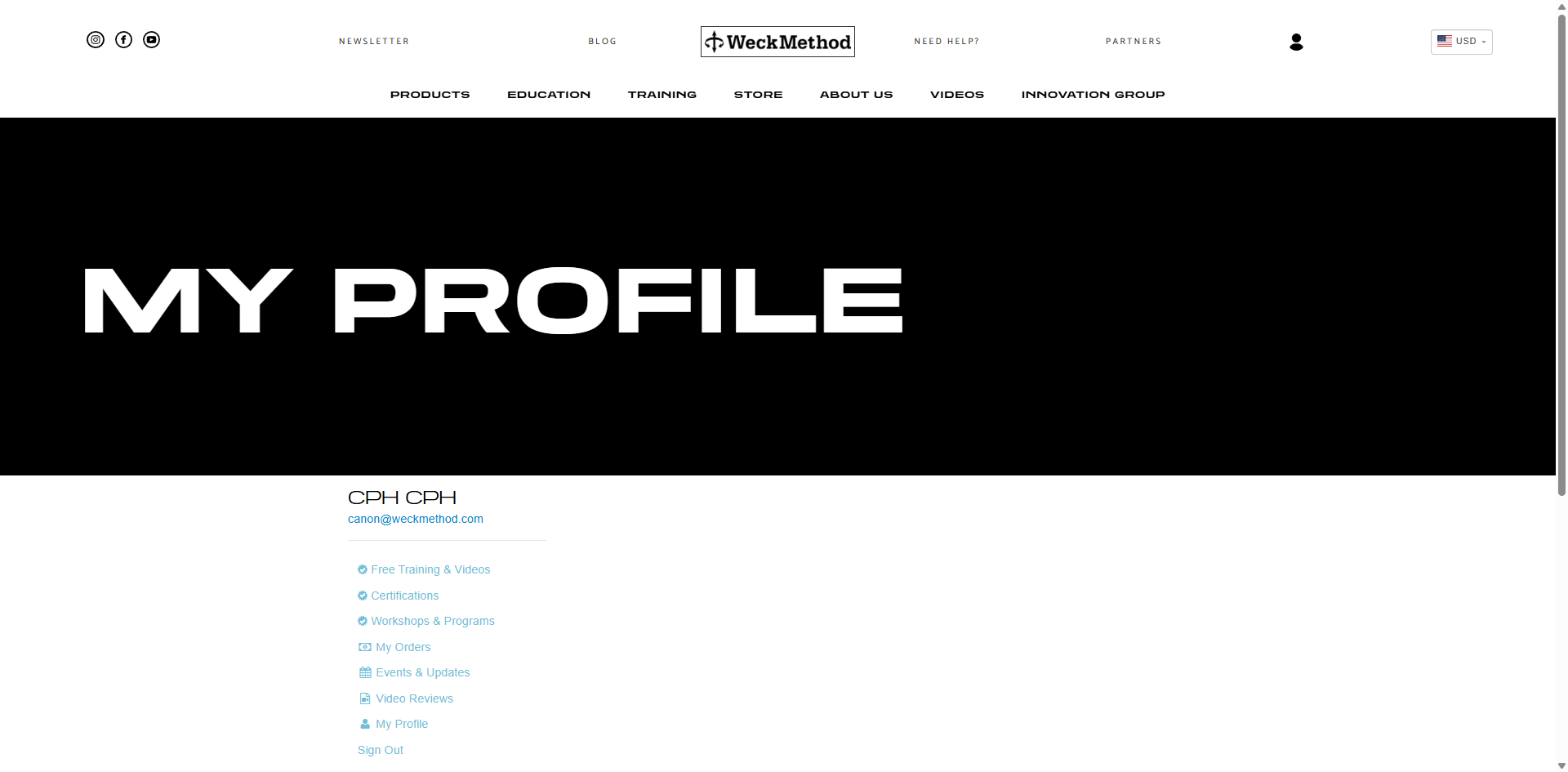
- Designing for three user-states simultaneously: consumers, certified trainers, admin staff
- Full UX/UI design for the marketplace platform, services registration, user dashboard, video player environment (3x user-states)
- Directing video program production and post-production: working with contracted editors on film shoots, branding, formatting,
- Managing program upload pipeline + deadlines (~40 hrs/course to upload+build, standardize photo assets across content library)
Fall 2025-present: leveraged design-to-code workflows
- Services registration UX overhaul + admin features, equipment library + payment models backend updates
- Frontend prototype: React SPA with video player, progress tracking, video controls bar
- Partner profit-split billing system with variable thresholds
- Shopping cart + multi-item billing infrastructure
- All code tested locally , audited against production guidelines before handoff
Advocating for the user against the path of least resistance
Lack of defined intent meant the executives' vision changed as time passed. Scope expanded, and changing business-conditions forced reactive pivots while I was the only person in the room applying product thinking to what was being treated as a simple website project. These are a few decisions I fought for:
Refused to paywall the homepage
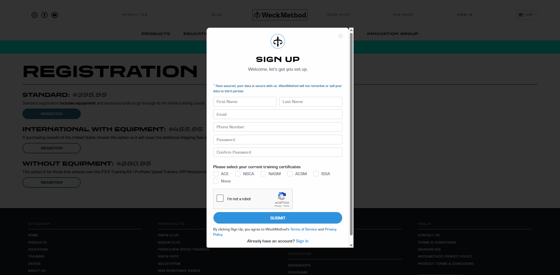
- Leadership wanted to require email registration before users could move beyond the homepage. I pushed back hard. Thiswas a marketplace, implying explorative open browsing to drive discovery and conversion. You don't gate a storefront. The homepage stayed open, and users can browse the catalog before deciding to purchase.
Proposed text-based accordions over thumbnail-driven nested navigation
- The content structure had infinitely nestable depth; courses contain modules, with lessons and sublessons. I proposed text-based accordions (pattern used by Coursera, Masterclass). Leadership insisted on visual thumbnails at every level. I was overruled, forced to adopt the constraint, and manage the added design complexity
Full-color thumbnails for locked courses, not grayed-out gates
- The initial direction: gray out courses users hadn't purchased. I argued for keeping all thumbnails full-color and browsable. The platform should encourage curiosity and exploration, not create a walled garden that reminds users of what they can't access. Open browsing is a staple of any successful content marketplace that works; Netflix, YouTube, Coursera.
Standardized all thumbnails to 16:9 with 9:16 mobile variants
- With dozens of courses and a thumbnail-based navigation system, the photo dependency pipeline was becoming a bottleneck. I mandated a single aspect ratio standard across all course imagery. 16:9 for desktop and 9:16 variants for mobile to minimize unique asset counts per course and create a visually consistent browsing experience.
I spoke with real users, and was condoned for advocating for them.
I designed and distributed a task-based feedback survey and conducted structured interviews with four general users and two certified trainers. The feedback was consistent and actionable:
- Navigation between videos was painful — Users had to close the video player, scroll to find the next video, and reopen it — repeating this dozens of times per course. Every interview surfaced frustration with the mobile video content navigation. I built a previous/next control bar directly inside the video player window. This feature had been deprioritized by leadership despite clear user demand. I made the product call to build it anyway; the user signal was overwhelming and the incremental cost was negligible relative to the impact on course completion. Further savings came along with my ability to code designs myself during upcoming phases.
- Users couldn’t tell videos from categories — Videos and nested category folders appeared in the same row with icons that proved insufficient for understanding. I trialed several differnt icon variationsthereafter on thumbnails and additional text indication so users could immediately differentiate playable content from navigation layers.
- Naming conventions were confusing — Internal terminology didn’t match how viewers thought about navigating content. I revised labels based on the language users noted they are accustomed to, which resembled a traditional book structure.
- The blue gradient branding was overwhelming — Users found the heavy branded gradient treatment visually fatiguing across a content-dense interface. I reduced its presence to let the content breathe.
- Event host trainers requested visibility — Both Trainer respondents noted frustration with the inability to easily contact those attending their live events prior to start-date as well as the lack of information regarding the equipment they should have available per the attendees' registration decisions. This was solved easily with a partial for Host Trainers on the event details page where an attendee list, equipment inventory and contact information export were added for this user-type with little effort and was well-received by trainers.
Shipping as the sole product-person
This project did not move in a clean line from spec -> design -> build -> launch. The reality was messier, with difficulties arising from all sides; organizational, technical and financial.
- Changing vision, with no consensus-view — Requirements shifted as leadership's understanding of the product evolved. I was often building product discipline (PRDs, sprint structure, phased delivery) around a moving target, while absorbing blame for pace when scope expanded faster than output.
- Part-time engineers on line-item billing — Engineering resources were part-time contractors billed per task. Every feature required a cost negotiation. I had to fight for budget line by line while also managing the engineering relationship and maintaining project continuity across fragmented availability.
- Broken infrastructure ate sprint time — Video uploading was intermittently broken and painfully slow. Backend issues surfaced mid-sprint and had to be triaged before planned work could continue. These weren't bugs I introduced — they were years of accumulated technical debt that only became visible once we started building on top of the existing system.
- 40-hour course upload pipeline — Each video course took approximately 40 hours to fully upload and build, due in part to deep structural issues with the unreliable uploading architecture and content volume. Filming direction, editor coordination, branding and formatting review, content structuring, thumbnail creation, metadata, and upload. I managed this pipeline, including video shoot days and post-production, shifting engineering sprints to attack the minimum necessary repairs strategically to maintain pace.
- Designing for three user-types at once — Every feature had both a consumer, trainer and admin interface, with unique screens for distinctions between Trainers and Master Trainers. Each deliverable thus had multiple dependencies and required me to become an expert on the codebase so to better explain context to the engineers and to design with intent.
Friction we couldn't afford to avoid
The primary goal of the platform upgrade was providing nested layering support to service the content depth our Trainers desired for a high-quality fitness programming product. I was provided the visual constraint of using thumbnail-based navigation and a budget constraint dictating we wouldn't be refactoring the video player to React. The target was a viewing experience on par with MasterClass or Coursera wherein friction between learning and navigating is never felt.
- Lessons are just endless scrollable lists of video thumbnails in a constrained window
- Platform architecture couldn't support nested content depth the business required
- No progress-tracking, users lost their place after every session
- Limited video player controls
- Nested navigation supporting variable content depth (course -> section -> lesson) to organize hundreds of videos into navigable depth
- In-player controls so users never leave the viewing experience
- Progress tracking and auto-advance across lessons
- a single responsive codebase
The full platform; consumer marketplace and admin console
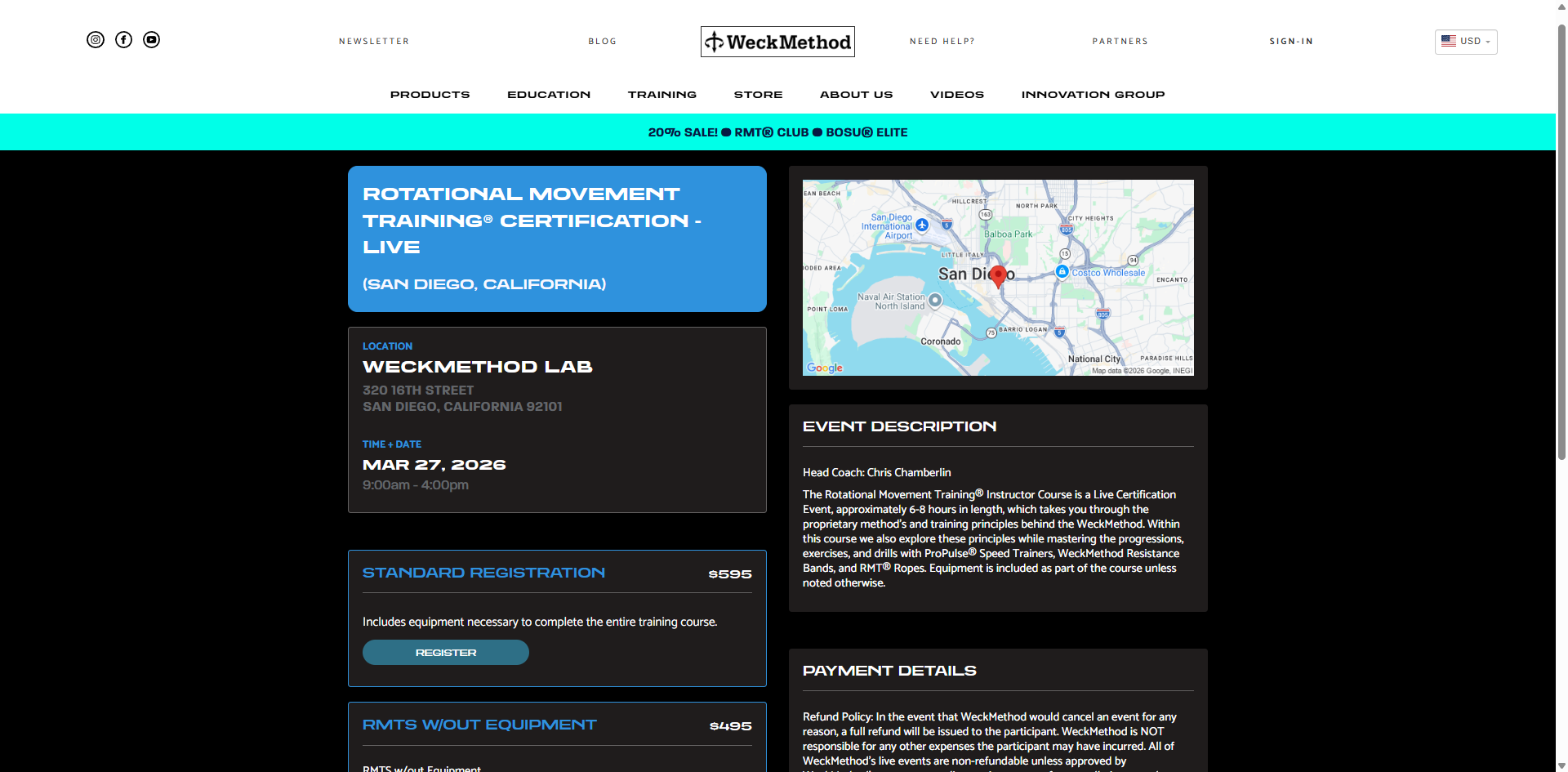
- Consumer marketplace — Course catalog with open browsing, visual thumbnail navigation, category filtering, and a purchase flow integrated with the existing payment system. Designed to encourage discovery and exploration, rather than gate content behind logins.
![[background image] image of landscaping office space for a landscaping service](https://cdn.prod.website-files.com/68312696c5081fe7d23d7f08/69ba14e572e1e5d0b97bdf50_video-platform-hero.png)
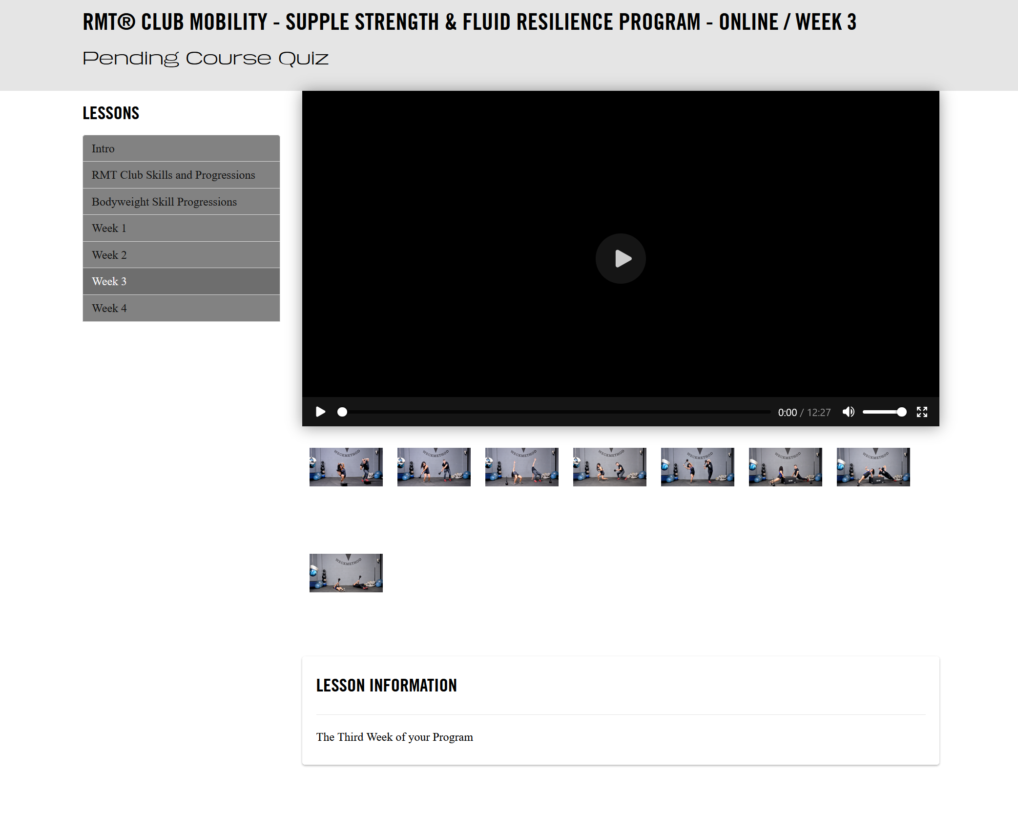
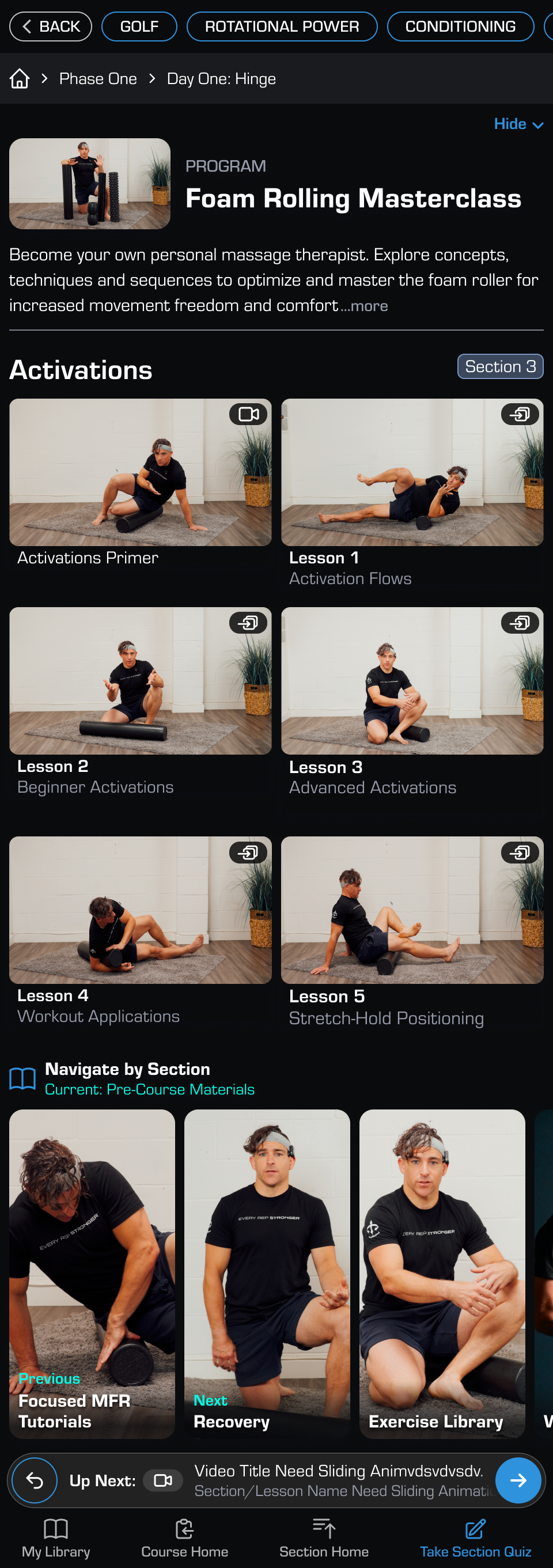
- Video learning experience — Designed for seamless playback with SPA-like navigation, progress indicators, auto-advance between lessons, mini-player for browsing while watching, and a nested content structure that handles arbitrary course depth.
![[background image] image of landscaping office space for a landscaping service](https://cdn.prod.website-files.com/68312696c5081fe7d23d7f08/69baec14d54a92642b1f1587_DT.png)
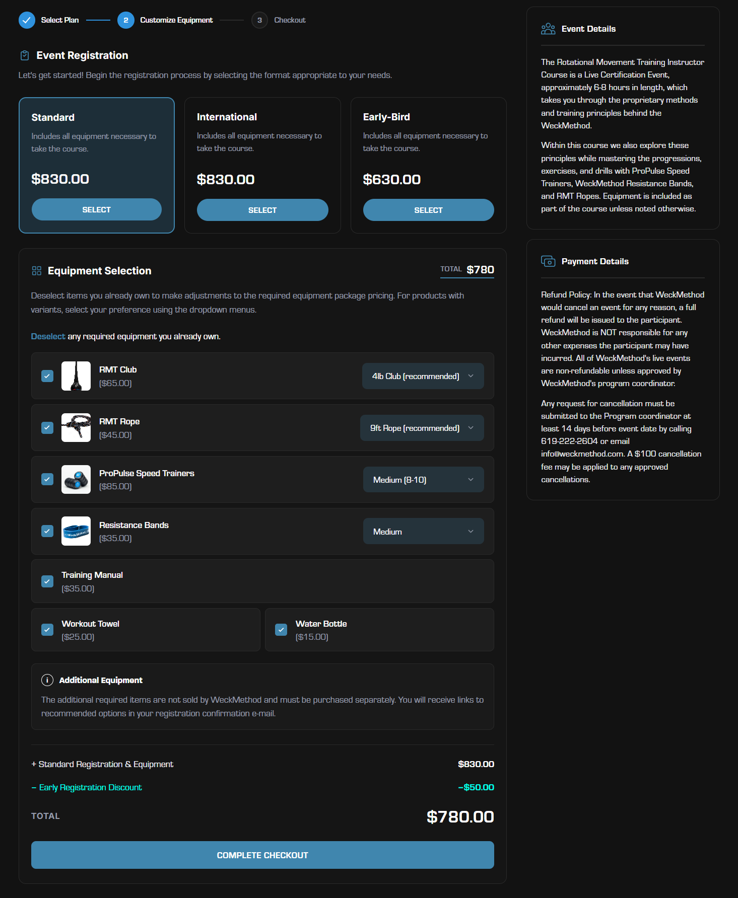
- Services registration equipment-selection flow — Full admin interface for managing courses, pricing, content uploads, and user permissions. Designed to reduce the manual overhead that was eating admin staff time (event registration, bundle creation, and customer service in particular).
![[background image] image of landscaping office space for a landscaping service](https://cdn.prod.website-files.com/68312696c5081fe7d23d7f08/69aa8082e5b4a3f62a9d2747_chrome_UoQTwsrKHa.png)
- Mobile-first responsive design — Thumbnail text placement adapted per viewport; text overlaid on thumbnails at larger sizes for density. Text below thumbnails on mobile to mirror familiar patterns like YouTube. Every screen designed for both desktop and mobile from the start.
Two years of building product discipline from scratch
Designed the full platform UX
- Designed the full platform UX: consumer marketplace, user dashboard, course navigation, purchase flows, admin content management. Conducted user research after initial prototype. Directed video course production throughout this time, coordinating filming + editors, establishing branding and formatting standards, managing the upload pipeline while balancing other ongoing initiatives.
Business conditions shifted priorities and limited budget further, while existing architecture created blockers
- Tariffs throughout 2025 heavily threatened cash-flow projections and internal priorities while the engineering sprints moved at an already slow part-time pace. The project roadmap suffered culling due to prioritization and required redesigns at frequent points, while the solution to thumbnail-based navigation combined with the existing constraints was still being solved. Video content uploads were failing and required a multi-week shift of engineering resources to repair the video upload, re-encoding and hosting workflow.
- Engineering contractors went out of business. Time remaining shifted to a wind-down and documentation focus. First onboarded new hire disappeared after 3 weeks of time-intensive onboarding. Project stalled. A 5-week lapse for candidate searching took precedent while I juggled other work. After over a year of PM work, design, and production management, I had a complete spec, a full prototype, and no one to build it.
Realized I could unblock this myself, and save the budget that was killing us
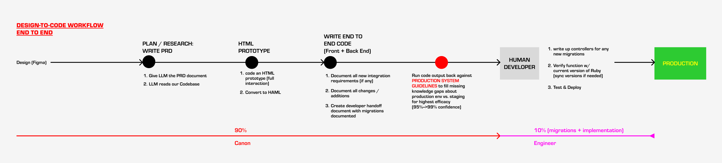
- Budget constraints hindered this project from day one. Every feature was a line-item negotiation. Then the engineering resource disappeared entirely. After two years embedded in the codebase I knew the system deeply enough to contribute code, not just specs. I picked up AI-assisted development and started building the remaining sprints end-to-end. I had clarified production environment quirks with the previous engineer before parting ways to ensure my local code would be audited at production-ready standards.
End-to-End Design to Code development
- Built working systems across the full platform frontend, services registration and admin tooling, partner billing, shopping cart infrastructure. All tested locally with production data-syncs. Audited my own code thoroughly before handoff to reduce engineering costs. The effort to reach production dropped from "build everything from Figma" to "review, polish, and deploy."
Leveraging AI to keep the project moving
When engineering resources disappeared entirely, I didn’t wait. After two years entrenched in the codebase assembling PRDs and sprints, reviewing engineering output, and understanding the full data model; I picked up AI-assisted development and started building working systems myself after a build-vs-buy analysis determined it was faster and less costly than onboarding another contractor at this stage.
I was making a calculated move to prevent a two-year initiative from dying on the vine. I directed every decision regarding what to build, how to structure it, and which patterns to mirror to produce clean, audited, functional code an engineer could review and implement.
- Production-handoff workflow — Before writing any code, I created a structured questionnaire for the original developer covering code standards, testing practices, error handling patterns, migration conventions, security standards and codebase-specific quirks. The goal was to fill gaps on blind spots Claude could not see without production access. I ran all code output against this document as a final audit step to ensure my code was as close as could be possible to production-ready out of the box. The intent was to limit clean-up work, implementation developer frustration, and of course, save development costs.
- Partner profit-split system — Admin-facing billing view with variable split ratios that adjust at configurable revenue thresholds. Two-sided workflow: partners apply through a consumer-facing form, admin reviews and approves.
- Services registration journey redesign + admin & payments overhaul — Product-to-course assignment interface and underlying equipment library backend, enabling variable registration options and pricing for customer flexibility rather than fixed packages.
- Shopping cart + billing infrastructure — Embedded cart with multi-item purchasing support, bundled discounts, and changes to how transactions are recorded.
- React-island SPA mobile video player refactor — The existing Rails architecture required full page reloads between every lesson. The budget couldn't support a frontend rebuild to solve this. I built a refactor React prototype the way it should have been built originally if not for budget constraints. Fully functional locally, with progress-tracking, embedded mini video-player, auto-advance, and fluid lesson-to-lesson transitions rather than page reloads.
Two years of building product discipline fom scratch
The platform is currently 95% complete and working on staging. The final blocker is a services-side front-end + admin deployment and a lapse in engineering contractor hiring. I do not have production metrics yet, although the full marketing campaign and launch plan has been mapped.